01 산점도
-01 산점도
-02 교차산점도
02 bar plot
03 pie chart
04 hist
01 산점도
-01 산점도
## 시각화
card.plot(kind = 'scatter') # 옵션 전달 복잡
plt.scatter(x, # x축 좌표
y, # y축 좌표
kwargs)
plt.scatter(x, # x축 좌표
y, # y축 좌표
marker, # 점모양
s, # 점크기
c, # 색(color 옵션)
cmap) # 팔레트 이름
예) iris data 산점도 출력
from sklearn.datasets import load_iris
iris = load_iris()
iris.keys()
X = iris['data']
y = iris['target'] # 'setosa':0, 'versicolor':1, 'virginica':2
iris['target_names'] # ['setosa', 'versicolor', 'virginica']
iris['feature_names'] # ['sepal length (cm)', 'sepal width (cm)', 'petal length (cm)', 'petal width (cm)']
print(iris['DESCR'])
# 하나의 산점도 출력(x축 : sepal length, y축 : sepal width)
plt.scatter(X[:,0], X[:,1], c = y) # y마다 서로 다른색(기본색)
plt.scatter(X[:,0], X[:,1], c = y, cmap = 'Set2') # 외부 팔레트 지정
plt.scatter(X[:,0], X[:,1], c = y) # y마다 서로 다른색(기본색)
plt.spring()
# 4개 산점도 동시 출력
plt.subplot(2,2,1)
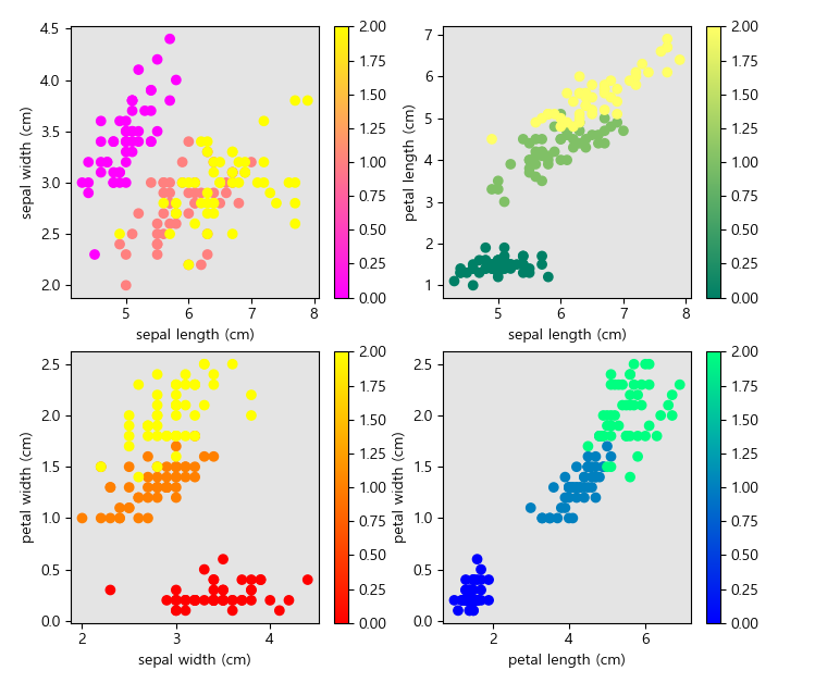
ex) 4개 산점도 동시 출력
# 1) sepal length vs sepal width
plt.subplot(2,2,1)
plt.scatter(X[:,0], X[:,1], c = y)
plt.spring()
plt.colorbar()
plt.xlabel(iris['feature_names'][0])
plt.ylabel(iris['feature_names'][1])
# 2) sepal length vs petal length
plt.subplot(2,2,2)
plt.scatter(X[:,0], X[:,2], c = y)
plt.summer()
plt.colorbar()
plt.xlabel(iris['feature_names'][0])
plt.ylabel(iris['feature_names'][2])
# 3) sepal width vs petal width
plt.subplot(2,2,3)
plt.scatter(X[:,1], X[:,3], c = y)
plt.autumn()
plt.colorbar()
plt.xlabel(iris['feature_names'][1])
plt.ylabel(iris['feature_names'][3])
# 4) petal length vs petal width
plt.subplot(2,2,4)
plt.scatter(X[:,2], X[:,3], c = y)
plt.winter()
plt.colorbar()
plt.xlabel(iris['feature_names'][2])
plt.ylabel(iris['feature_names'][3])
-02 교차산점도
import matplotlib.pyplot as plt
from pandas.plotting import scatter_matrix
scatter_matrix(frame, # 데이터프레임만 전달 가능
figsize, # figure size
marker) # 점 종류
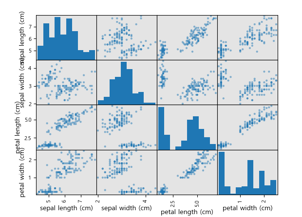
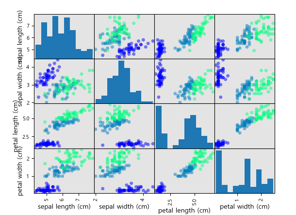
ex) iris의 독립변수들의 교차 산점도 (종속변수별로 색 구분)
from sklearn.datasets import load_iris
iris = load_iris()
x = iris['data']
y = iris['target']
iris_x = pd.DataFrame(X, columns = iris['feature_names'])
# 시각화
scatter_matrix(iris_x)
scatter_matrix(iris_x, c = y)
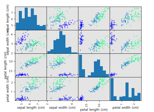
scatter_matrix(iris_x, c = y, s = 100)
[ 연습문제 ]
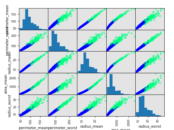
cancer.csv 파일을 읽고 설명변수들끼리 상관관계가 가장 높은 4개 집합에 대해 산점도 출력
cancer = pd.read_csv('cancer.csv')
# 불필요한 변수 제거
cancer.drop('id', axis = 1, inplace = True)
# 데이터 분리
y = cancer['diagnosis']
x = cancer.drop('diagnosis', axis = 1)
# 상관관계 행렬 확인
df_corr = x.corr()
x.corr()
Out[84]:
                         radius_mean  ...  fractal_dimension_worst
radius_mean                 1.000000  ...                 0.007066
texture_mean                0.323782  ...                 0.119205
perimeter_mean              0.997855  ...                 0.051019
area_mean                   0.987357  ...                 0.003738
smoothness_mean             0.170581  ...                 0.499316
compactness_mean            0.506124  ...                 0.687382
concavity_mean              0.676764  ...                 0.514930
concave_points_mean         0.822529  ...                 0.368661
symmetry_mean               0.147741  ...                 0.438413
fractal_dimension_mean     -0.311631  ...                 0.767297
radius_se                   0.679090  ...                 0.049559
texture_se                 -0.097317  ...                -0.045655
perimeter_se                0.674172  ...                 0.085433
area_se                     0.735864  ...                 0.017539
smoothness_se              -0.222600  ...                 0.101480
compactness_se              0.206000  ...                 0.590973
concavity_se                0.194204  ...                 0.439329
concave_points_se           0.376169  ...                 0.310655
symmetry_se                -0.104321  ...                 0.078079
fractal_dimension_se       -0.042641  ...                 0.591328
radius_worst                0.969539  ...                 0.093492
texture_worst               0.297008  ...                 0.219122
perimeter_worst             0.965137  ...                 0.138957
area_worst                  0.941082  ...                 0.079647
smoothness_worst            0.119616  ...                 0.617624
compactness_worst           0.413463  ...                 0.810455
concavity_worst             0.526911  ...                 0.686511
concave_points_worst        0.744214  ...                 0.511114
symmetry_worst              0.163953  ...                 0.537848
fractal_dimension_worst     0.007066  ...                 1.000000

[30 rows x 30 columns]
# 상관관계 top 4 확인
df_corr.stack()
df_corr.stack()
Out[86]:
radius_mean              radius_mean                1.000000
                         texture_mean               0.323782
                         perimeter_mean             0.997855
                         area_mean                  0.987357
                         smoothness_mean            0.170581

fractal_dimension_worst  compactness_worst          0.810455
                         concavity_worst            0.686511
                         concave_points_worst       0.511114
                         symmetry_worst             0.537848
                         fractal_dimension_worst    1.000000
Length: 900, dtype: float64
# 상관관계 top 4 확인
df_corr = df_corr.stack()
df_corr = df_corr[df_corr != 1]
df_cols = df_corr.abs().sort_values(ascending = False).drop_duplicates()[:4].reset_index()
a1 = df_cols.iloc[:,0]
a2 = df_cols.iloc[:,1]
cols = pd.concat([a1,a2]).drop_duplicates()
pd.concat([a1,a2]).drop_duplicates()
Out[122]:
0     perimeter_mean
1    perimeter_worst
2        radius_mean
3          area_mean
1       radius_worst
dtype: object
# 교차산점도 출력
total = cancer.loc[:, cols]
y = y.map({'Malignant' : 1, 'Benign' : 0})
scatter_matrix(total, c = y, s = 100)
02 bar plot
- x축 : 범주형 (수치형이 아닐 수 있음)
- y축 : 수치
1. df.plot(x=, # x축 좌표
y=, # y축 좌표
kind = 'bar')
ex)
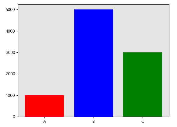
df = pd.DataFrame({'name' : ['A','B','C'], 'qty' : [1000, 5000, 3000]})
df.plot(x = 'name', y = 'qty', kind = 'bar')

2. plt.bar(x, # x축 좌표
height, # y축 좌표
width, # 막대 너비
bottom, # 시작위치
...)
ex)
plt.bar(x = df['name'], height = df['qty'], color = ['red', 'blue', 'green'])
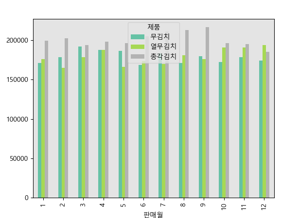
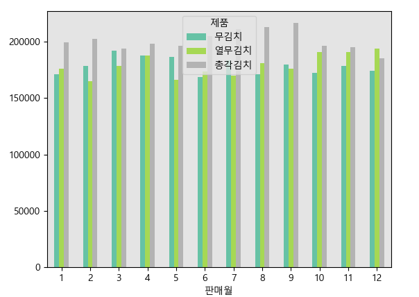
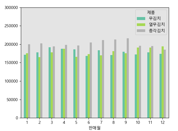
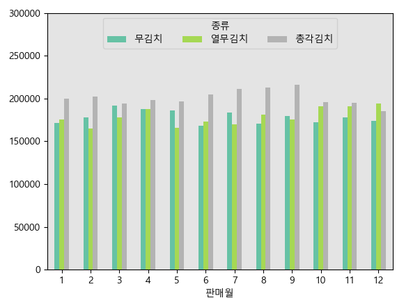
ex) kimchi_test.csv 파일을 읽고 제품별 / 월별 판매량 비교 막대그래프 출력
df = pd.read_csv('kimchi_test.csv', encoding = 'cp949')
df.head()
df.head()
Out[131]:
   판매년도  판매월    제품   판매처     수량       판매금액
0  2013    1  총각김치  대형마트  27916  233968900
1  2013    1  총각김치   백화점  11971   99796735
2  2013    1  총각김치   편의점   1603    2264200
3  2013    2  총각김치  대형마트  23057  194593960
4  2013    2  총각김치   백화점  11678  103106940
# 1) 기초 데이터 생성 (wide data로 변경)
- index -> x축 좌표
- column별로 서로 다른 막대그래프 출력
total = df.pivot_table('수량','판매월','제품',aggfunc='sum')
df.pivot_table('수량','판매월','제품',aggfunc='sum')
Out[132]:
제품      무김치    열무김치    총각김치
판매월
1    171280  175739  199506
2    178234  165145  202188
3    192111  178176  194044
4    187979  187602  197962
5    186199  166027  196558
6    168436  173311  204635
7    183212  170079  211129
8    170953  180941  212806
9    179875  175890  216473
10   172249  190602  196142
11   178327  190661  194855
12   173909  193826  185355
# 2) 시각화
total.plot(kind = 'bar', colormap = 'Set2')
plt.xticks(rotation=0)
plt.ylim([0,300000])
plt.legend(title='종류', ncol=3, loc = 'upper center')
plt.ylabel('판매량', rotation = 0, loc = 'top')
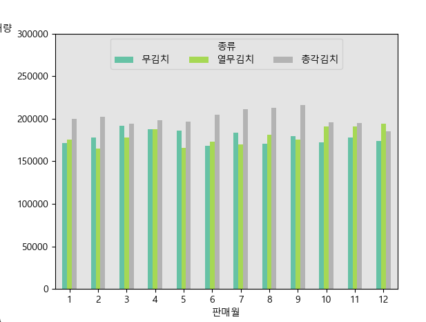
plt.title('월별 김치 판매량 비교', pad = 20)
plt.tight_layout()

[ 연습문제 ]
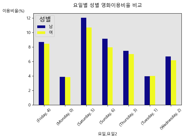
movie_ex1.csv 파일을 읽고 영화이용현황에 대해 요일별로 성별에 대한 비교 시각화 (막대그래프)
# 1. 기초 데이터 생성
from datetime import datetime
datetime(movie['년'], movie['월'], movie['일']) # 불가
datetime(movie['년'], movie['월'], movie['일'])
---------------------------------------------------------------------------
TypeError                                 Traceback (most recent call last)
Cell In[168], line 1
----> 1 datetime(movie['년'], movie['월'], movie['일'])

TypeError: 'Series' object cannot be interpreted as an integer
movie['날짜'] = pd.Series(map(lambda x,y,z : datetime(x,y,z), movie['년'], movie['월'], movie['일']))
# 또는
pd.to_datetime(movie['년'].astype('str') + '/' + movie['월'].astype('str') + '/' + movie['일'].astype('str'))
pd.Series(map(lambda x,y,z : datetime(x,y,z), movie['년'], movie['월'], movie['일']))
Out[169]:
0       2018-02-01
1       2018-02-01
2       2018-02-01
3       2018-02-01
4       2018-02-01

66865   2018-02-28
66866   2018-02-28
66867   2018-02-28
66868   2018-02-28
66869   2018-02-28
Length: 66870, dtype: datetime64[ns]
# 2. 요일 출력
movie['요일'] = movie['날짜'].dt.strftime('%A')
movie['요일2'] = movie['날짜'].dt.weekday
# 3. wide data 생성 (월화수목금토일 순서대로 정렬)
## sol1)
total = movie.pivot_table('이용_비율(%)', '요일', '성별', aggfunc = 'sum')
total = total.loc[['Monday','Tuesday','Wednesday','Thursday','Friday','Saturday','Sunday'],:]
total
Out[177]:
성별                남         여
요일
Monday      3.89914   3.82619
Tuesday     3.98454   3.99628
Wednesday   6.70139   6.14972
Thursday    7.45582   7.02565
Friday      8.71012   8.45795
Saturday   12.05580  10.67604
Sunday      9.13872   7.94626
## sol2)
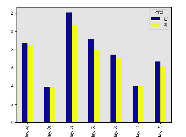
total = movie.pivot_table('이용_비율(%)', ['요일','요일2'],'성별',aggfunc='sum')
total
Out[179]:
성별                    남         여
요일        요일2
Friday    4     8.71012   8.45795
Monday    0     3.89914   3.82619
Saturday  5    12.05580  10.67604
Sunday    6     9.13872   7.94626
Thursday  3     7.45582   7.02565
Tuesday   1     3.98454   3.99628
Wednesday 2     6.70139   6.14972
total.sort_index(level=1)
total.sort_index(level=1)
Out[180]:
성별                    남         여
요일        요일2
Monday    0     3.89914   3.82619
Tuesday   1     3.98454   3.99628
Wednesday 2     6.70139   6.14972
Thursday  3     7.45582   7.02565
Friday    4     8.71012   8.45795
Saturday  5    12.05580  10.67604
Sunday    6     9.13872   7.94626
# 4. 시각화
total.plot(kind='bar', colormap = 'plasma')
plt.xticks(rotation = 45)
plt.ylabel('이용비율(%)', rotation=0, loc ='top')
plt.legend(title='성별', title_fontsize=15, fontsize=10, loc = 'upper left')
plt.title('요일별 성별 영화이용비율 비교', pad =15)
plt.tight_layout()
03 pie chart
plt.pie(x, # 각 파이 숫자
labels=labels, # 각 파이 이름
autopct='%.1f%%', # 값의 표현 형태
startangle=260, # 시작위치
radius = 0.8, # 파이 크기
counterclock=False, # 시계방향 진행 여부
explode = explode, # 중심에서 벗어나는 정도 설정(각각 서로 다른 숫자 전달 가능)
colors=colors, # 컬러맵 전달 가능
shadow=False, # 그림자 설정
wedgeprops=wedgeprops) # 부채꼴 모양 설정
ex) 파이차트 시각화
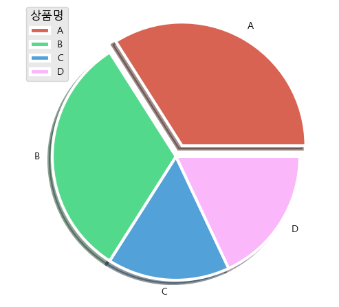
s1 = [34, 32, 16, 18]
labels = ['A','B','C','D']
colors = ['#d96353', '#53d98b', '#53a1d9', '#fab7fa']
ep1 = [0.1, 0, 0, 0]
plt.pie(s1, labels = labels, colors = colors, explode = ep1,
wedgeprops = {'linewidth':3, 'edgecolor':'white'},
shadow = True)

plt.legend(title = '상품명', fontsize = 10, title_fontsize=12, loc = 'upper left')
plt.tight_layout()
04 hist
plt.hist(data,
bins=10, # 구간 수 (숫자 or 리스트)
range=(0, 100), # x축 범위
density=False, # True면 확률밀도로 표시
cumulative=False, # True면 누적 히스토그램
histtype='bar', # 'bar' 'barstacked' 'step' 'stepfilled'
align='mid', # 막대 정렬 'left' 'mid' 'right'
orientation='vertical', # 방향 'vertical' 'horizontal'
rwidth=1.0, # 막대 너비 비율 (0~1)
log=False, # True면 y축 로그 스케일
color='blue', # 막대 색상
edgecolor='black', # 테두리 색
alpha=0.7, # 투명도 (0~1)
label, # 범례 이름
)
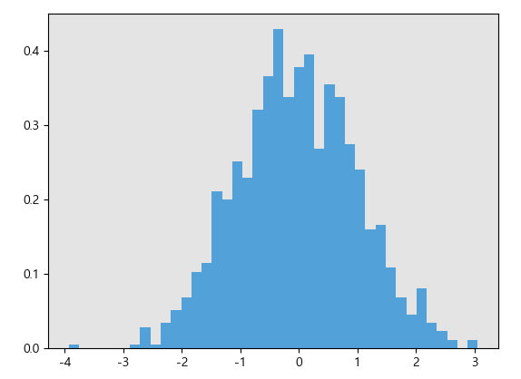
ex) 히스토그램 시각화
import numpy as np
s1 = pd.Series(np.random.randn(1000))
s1.hist(bins=40)
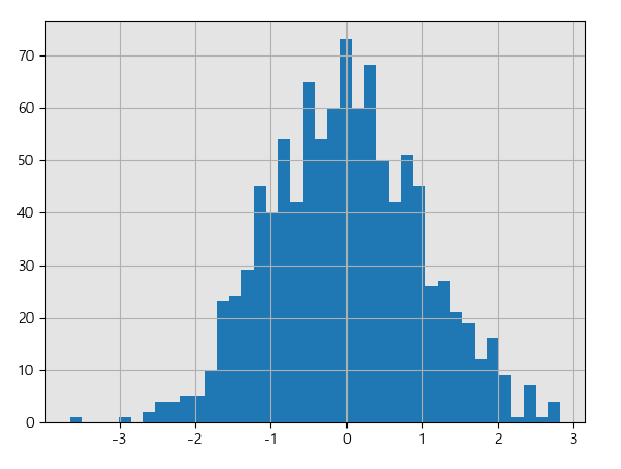
plt.hist(s1, bins=40, density=True, color = '#53a1d9')
'아이티윌_데이터 분석 55기 > 강의내용 필기_Python' 카테고리의 다른 글
| #11 11일차_다양햔 replace 형태, long <-> wide 변환 (0) | 2026.05.26 |
|---|---|
| #9 9일차_ multi - level index 실습 (0) | 2026.05.21 |
| #8 8일차_빈도수 / 유일값 확인, 중복값 처리, shift, multi-level index (0) | 2026.05.20 |
| #7 7일차_논리연산자/포함연산자, pandas index 설정, pandas 정렬, 벡터화 내장된 문자열 메서드, idxmax / idxmin (0) | 2026.05.19 |
| #6 6일차_pd의 행·열 결합 / 수학 및 통계 함수·메서드 / 결측치 처리 (0) | 2026.05.18 |