01. ggplot2
-01 기본 구성
-02 시각화 함수
-03 옵션 함수
-04 산점도
-05 선그래프
01. ggplot2
- 다양한 시각화 기능을 가지고 있는 패키지
- 가장 대중적
- 데이터프레임 시각화(각 컬럼별 선그래프, 산점도 등등)
install.packages('ggplot2')
library(ggplot2)
-01 기본 구성
- ggplot : 데이터 정의
- aes : 변수(축) 정의
-02 시각화 함수
- geom_bar()
- geom_line()
- geom_point()
- geom_boxplot()
- geom_histogram()
-03 옵션 함수
- xlab(), ylab(), labs()
- theme()
-04 산점도
ggplot(data = ,
mapping = aes(x = ... , y = ... , col = ...)) +
geom_point() +
labs() +
theme()
# 예제) iris data 산점도
> ggplot(iris, aes(x = Sepal.Length,
+                  y = Sepal.Width,
+                  col = Species)) +
+   geom_point()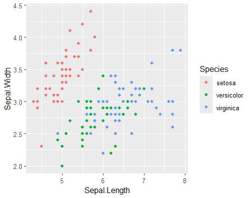
# 점 크기 및 모양 변경
> ggplot(iris, aes(x = Sepal.Length,
+                  y = Sepal.Width,
+                  col = Species)) +
+   geom_point(size = 2, shape = 2)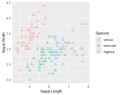
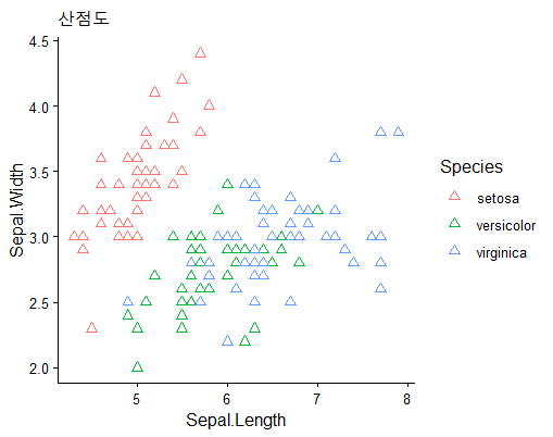
# 제목, 축 제목, 테마 설정
> plot(iris[,-5], col=iris$Species)
> ggplot(iris, aes(x = Sepal.Length,
+                  y = Sepal.Width,
+                  col = Species)) +
+   geom_point(size = 2, shape = 2) +
+   labs(title = '산점도', x = 'Sepal.Length', y = 'Sepal.Width') +
+   theme_classic()
# 색상, 테마 변경
p1 <- c('#0000ff', '#ff00ff', '#00cc00')
> ggplot(df1, aes(x = 시간대,
+                 y = 총통화건수,
+                 col = 업종)) +
+   geom_line(linewidth = 0.8) +
+   labs(title = '시간대별 업종별 통화건수 현황') +
+   scale_color_manual(values = my_col1) +
+   theme_classic()
> p1 <- c('#0000ff', '#ff00ff', '#00cc00')
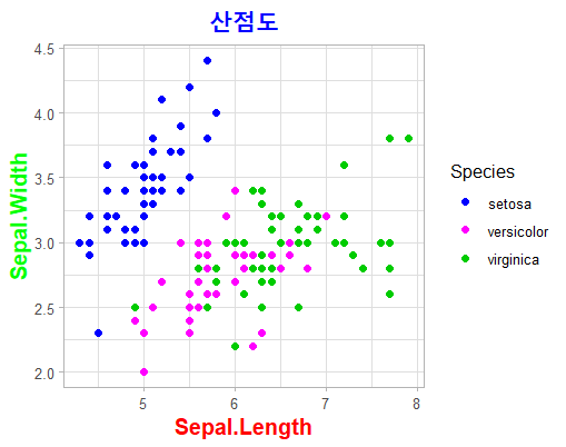
> p1 <- c('#0000ff', '#ff00ff', '#00cc00')
> ggplot(iris, aes(x = Sepal.Length,
+                  y = Sepal.Width,
+                  col = Species)) +
+   geom_point(size = 2) +
+   labs(title = '산점도', x = 'Sepal.Length', y = 'Sepal.Width') +
+   theme_light() +
+   scale_color_manual(values = p1) +
+   theme(
+     plot.title = element_text(
+       size = 18,
+       color = "blue",
+       face = "bold",
+       family = "sans",
+       hjust = 0.5   # 가운데 정렬
+     ),
+     axis.title.x = element_text(
+       size = 14,
+       color = "red",
+       face = "bold"
+     ),
+     axis.title.y = element_text(
+       size = 14,
+       color = "green",
+       face = "bold"
+     ))
-05 선그래프
> ggplot(iris, aes(x = Sepal.Length,
+                  y = Sepal.Width,
+                  col = Species)) +
+   geom_line() +
+   labs(title = '산점도', x = 'Sepal.Length', y = 'Sepal.Width') +
+   theme_classic()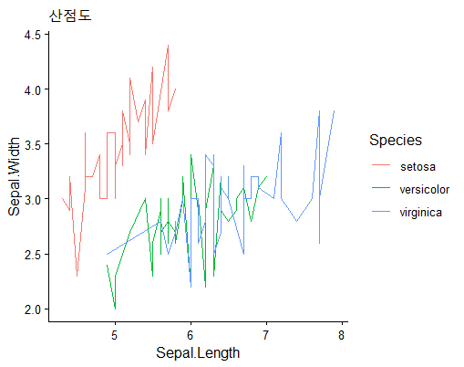
# 예제) 시간대별 각 배달음식에 대한 통화건수 현황 선그래프
> ggplot(df1, aes(x = 시간대,
+                 y = 총통화건수,
+                 col = 업종)) +
+   geom_line(linewidth = 0.8) +
+   labs(title = '시간대별 업종별 통화건수 현황') +
+   scale_color_manual(values = my_col3) +
+   theme_classic()
> ggplot(df1, aes(x = 시간대,
+                 y = 총통화건수,
+                 col = 업종)) +
+   geom_line(linewidth = 0.8) +
+   labs(title = '시간대별 업종별 통화건수 현황') +
+   scale_color_manual(values = my_col1) +
+   theme_classic()
더보기
더보기
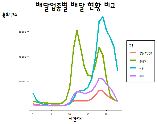
[문제풀이]
# 기초데이터 가공
> library(plyr)
> library(stringr)
>
> total <- ddply(deli, .(시간대, 업종), summarise, 통화건수 = sum(통화건수))
> total$업종 <- str_remove(total$업종, '음식점-')
> head(total)
  시간대          업종 통화건수
1      0 족발/보쌈전문     1679
2      0      중국음식     3582
3      0          치킨    10750
4      0          피자      990
5      1 족발/보쌈전문      977
6      1      중국음식     3343
# 시각화
> ggplot(total, aes(x = 시간대,
+                  y = 통화건수,
+                  col = 업종)) +
+   geom_line(size = 1.5) +
+   labs(title = '배달업종별 배달 현황 비교', x = '시간대', y = '통화건수') +
+   theme_classic() +
+   theme(
+     text = element_text(family = 'dongle'),
+     plot.title = element_text(
+       size = 28,
+       hjust = 0.5   # 가운데 정렬
+     ),
+     axis.title.x = element_text(
+       size = 18
+     ),
+     axis.title.y = element_text(
+       size = 18,
+       angle = 0
+     ),
+     legend.background = element_rect(
+       color = 'black',
+       fill = 'white'
+     ))
## 다양한 옵션
> ggplot(total, aes(x = 시간대,
+                   y = 통화건수,
+                   col = 업종)) +
+   geom_line(size = 1.2) +
+   labs(title = '배달업종별 배달 현황 비교',
+        x = '시간대', y = '통화건수') +
+   scale_x_continuous(breaks = total$시간대) +  # 시작눈금
+   scale_y_continuous(breaks = seq(0, 90000, 10000)) +
+   theme_classic() +
+   scale_color_manual(values = p1) +
+   theme(
+     text = element_text(family = 'dongle'),
+     plot.title = element_text(size = 28, hjust = 0.5),
+     axis.title.x = element_text(size = 18), # x축 이름
+     axis.title.y = element_text(size = 18, angle = 0), # y축 이름
+     axis.text.x = element_text(size = 15),  # x축 눈금
+     axis.text.y = element_text(size = 15),  # y축 눈금
+     legend.title = element_text(size = 15, color = 'red'),
+     legend.text = element_text(size = 12),
+     legend.background = element_rect(color = 'black', fill = 'white'),
+     #legend.position = "top",
+     #legend.justification = "center",
+     plot.background = element_rect(fill = "#F8F9F8"),
+     panel.background = element_rect(fill = "#F8F9F8"))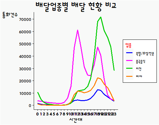
'아이티윌_데이터 분석 55기 > 강의내용 필기_통계 및 분석' 카테고리의 다른 글
| #2 2일차_추론, 확률분포, 정규분포, 표준정규분포, 중심극한정리 (0) | 2026.04.14 |
|---|---|
| #1 1일차_통계 기초, 표본추출, 측정과 척도, 기초 통계량, 확률분포 (0) | 2026.04.13 |
| #9 9일차_기본 시각화 : barplot, 이상치 탐색, 히스토그램, 커널밀도, 파이차트 (0) | 2026.04.10 |
| #8 8일차_dplyr, 시각화 (0) | 2026.04.09 |
| #7 7일차_데이터 형태 변환, NA 처리 (0) | 2026.04.08 |