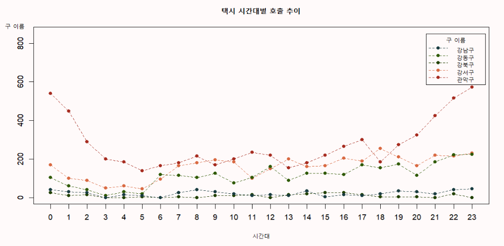
# 1. taxi의 시간대별 호출 추이를 지역별로 비교하는 선그래프 출력
# 단, 총택시콜 기준으로 상위 5개 구를 선택한 뒤 5개 구에 대해 시각화
taxi <- read.csv('taxi_call.csv', fileEncoding = 'cp949')
unique(taxi$발신지_시군구)
[내 답변]
head(taxi)
# 열 이름 정리
names(taxi) <- str_remove_all(names(taxi), '발신지_')
df1 <- taxi[,-5]
# 총택시콜 기준으로 상위 5개 구를 선택
df2 <- ddply(df1, .(시군구), summarise, 총통화건수 = sum(통화건수))
top5 <- df2[1:5, '시군구']
df3 <- filter(df1, 시군구 %in% top5)
# 시간대별, 시군구별 총 통화건수 구하기
df4 <- ddply(df3, .(시간대, 시군구), summarise, 총통화건수 = sum(통화건수))
head(df4)
# dcast
df5 <- dcast(df4, 시간대 ~ 시군구)
rownames(df5) <- df5$시간대
df5$시간대 <- NULL
head(df5)
# NA 처리
library(tidyr)
df5$강북구 <- replace_na(df5$강북구, 0)
df5$관악구 <- replace_na(df5$관악구, 0)
is.na(df5)
# 시각화
dev.new()
par(bg = '#FFFAFA')
par(family = 'gugi')
windowsFonts(
gugi = windowsFont("Gugi 보통")
)
my_col <- c('#193C40', '#2E5902', '#214001', '#D96941', '#A62B1F')
plot(df5$강남구, type = 'o', lty = 2, pch = 16, col = my_col[5],
xlab = '시간대', ylab = '', main = '택시 시간대별 호출 추이',
ylim = c(0, 850), axes = F)
lines(df5$강동구, type = 'o', lty = 2, pch = 16, col = my_col[4])
lines(df5$강북구, type = 'o', lty = 2, pch = 16, col = my_col[3])
lines(df5$강서구, type = 'o', lty = 2, pch = 16, col = my_col[2])
lines(df5$관악구, type = 'o', lty = 2, pch = 16, col = my_col[1])
legend(21.5, 850, legend = names(df5), col = my_col, lty = 2, pch = 16,
title = '구 이름')
mtext("구 이름",
side = 2,
line = 1,
las = 1,
at = 900)
axis(1, at = 1:nrow(df5), rownames(df5))
axis(2)
box()
[문제풀이]
library(plyr)
library(dplyr)
library(reshape2)
taxi <- read.csv('taxi_call.csv', fileEncoding = 'cp949')
gname <- (ddply(taxi, .(발신지_시군구), summarise, 총통화건수 = sum(통화건수)) |> arrange(-총통화건수) |>
filter(row_number() <= 5))[,1]
total <- filter(taxi, 발신지_시군구 %in% gname)
total1 <- dcast(total, 시간대 ~ 발신지_시군구, sum, value.var = '통화건수')
rownames(total1) <- total1$시간대
total1$시간대 <- NULL
# 시각화
# 1) 환경 세팅
p1 <- c('#193C40', '#2E5902', '#214001', '#D96941', '#A62B1F')
windowsFonts(
dongle = windowsFont("Dongle")
)
# 2) 그래프 출력
dev.new()
par(bg = '#F8F9F8')
par(family = 'dongle')
plot(total1$강남구, type = 'o', lty = 1, ylim = c(0,600), lwd =1.2, axes = F,
xlab = '시간대', ylab = '', cex.lab = 1.5, col = p1[1], col.lab = 'red')
lines(total1$강동구, type = 'o', lty = 1, lwd =1.2, col = p1[2])
lines(total1$도봉구, type = 'o', lty = 1, lwd =1.2, col = p1[3])
lines(total1$서초구, type = 'o', lty = 1, lwd =1.2, col = p1[4])
lines(total1$송파구, type = 'o', lty = 1, lwd =1.2, col = p1[5])
axis(1, at = 1:nrow(total1), rownames(total1), cex.axis = 1.5)
axis(2, cex.axis = 1.5)
box()
mtext('호출건수', side = 2, las = 1, at = 660, col = 'red', cex = 2)
title('구별 시간대별 택시호출 비교', col.main = 'red', cex.main = 2.5)
legend(5, 600, legend = names(total1), col = p1,
lty = 1, horiz = T, bg = '#EEF2EF',
title = '구이름', title.col = 'red', title.cex = 1.5)
legend('top', inset = c(0, 0.03),legend = names(total1), col = p1,
lty = 1, horiz = T, bg = '#EEF2EF',
title = '구이름', title.col = 'red', title.cex = 1.5)
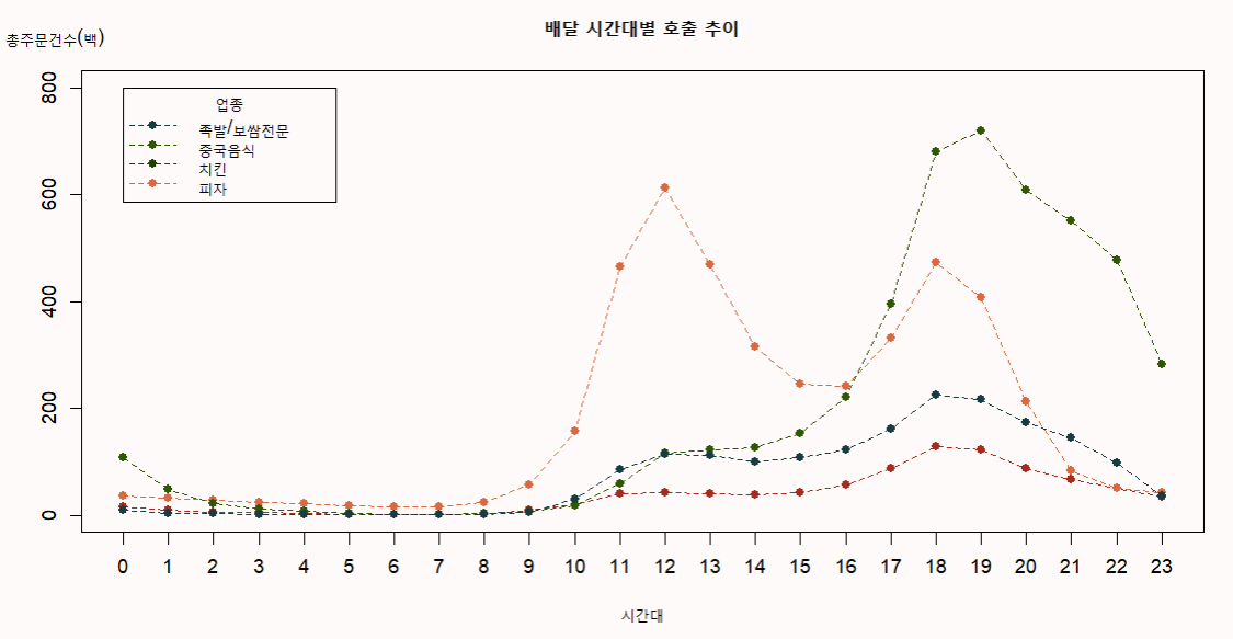
# 2. 배달의 시간대별 호출 추이를 각 업종별로 비교하는 선 그래프 출력
deli <- read.csv('delivery.csv', fileEncoding = 'cp949')
[내 답변]
deli <- read.csv('delivery.csv', fileEncoding = 'cp949')
str(deli)
head(deli)
deli1 <- deli[c('시간대','업종','통화건수')]
deli1$업종 <- str_remove_all(deli1$업종, '음식점-')
deli2 <- ddply(deli, .(시간대, 업종), summarise, 총통화건수 = sum(통화건수))
head(deli2)
deli3 <- dcast(deli2, 시간대~업종)
rownames(deli3) <- deli3$시간대
deli3$시간대 <- NULL
names(deli3) <- str_remove_all(names(deli3), '음식점-')
# 시각화
plot(deli3$'족발/보쌈전문'/100, type = 'o', lty = 2, pch = 16, col = my_col[5],
xlab = '시간대', ylab = '', main = '배달 시간대별 호출 추이',
ylim = c(0,800), axes = F)
lines(deli3$'중국음식'/100, type = 'o', lty = 2, pch = 16, col = my_col[4])
lines(deli3$'치킨'/100, type = 'o', lty = 2, pch = 16, col = my_col[2])
lines(deli3$'피자'/100, type = 'o', lty = 2, pch = 16, col = my_col[1])
legend(1, 800, legend = names(deli3), col = my_col, lty = 2, pch = 16,
title = '업종')
mtext("총주문건수(백)",
side = 2,
line = -1,
las = 1,
at = 900)
axis(1, at = 1:nrow(deli3), rownames(deli3))
axis(2)
box()
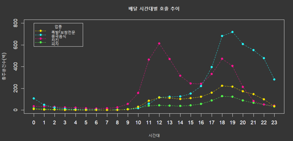
# 시각화2
par(bg = '#353535')
?mtext
my_col2 <- c('#FFE400', '#24FCFF', '#FF1291', '#53FF4C')
plot(deli3$'족발/보쌈전문'/100, type = 'o', lty = 2, pch = 16, col = my_col2[4],
xlab = '시간대', ylab = '총주문건수(백)', main = '배달 시간대별 호출 추이',
ylim = c(0,800), axes = F,
col.axis = 'white', col.lab = 'white', col.main = 'white')
lines(deli3$'중국음식'/100, type = 'o', lty = 2, pch = 16, col = my_col2[3])
lines(deli3$'치킨'/100, type = 'o', lty = 2, pch = 16, col = my_col2[2])
lines(deli3$'피자'/100, type = 'o', lty = 2, pch = 16, col = my_col2[1])
legend(1, 800, legend = names(deli3), col = 'white', lty = 2, pch = 16, lwd = 6,
title = '업종', box.col = 'white', title.col = 'white', text.col = 'white')
legend(1, 800, legend = names(deli3), col = my_col2, lty = 2, pch = 16,
title = '업종', box.col = 'white', title.col = 'white', text.col = 'white')
mtext("총주문건수(백)",
side = 2,
line = -1,
las = 1,
at = 900
col = 'white')
axis(1, at = 1:nrow(deli3), rownames(deli3), col = 'white', col.axis = 'white')
axis(2, col = 'white', col.axis = 'white')
box(col = 'white')
[문제풀이]
library(plyr)
library(dplyr)
library(reshape2)
taxi <- read.csv('taxi_call.csv', fileEncoding = 'cp949')
gname <- (ddply(taxi, .(발신지_시군구), summarise, 총통화건수 = sum(통화건수)) |> arrange(-총통화건수) |>
filter(row_number() <= 5))[,1]
total <- filter(taxi, 발신지_시군구 %in% gname)
total1 <- dcast(total, 시간대 ~ 발신지_시군구, sum, value.var = '통화건수')
rownames(total1) <- total1$시간대
total1$시간대 <- NULL
# 시각화
# 1) 환경 세팅
p1 <- c('#193C40', '#2E5902', '#214001', '#D96941', '#A62B1F')
windowsFonts(
dongle = windowsFont("Dongle")
)
# 2) 그래프 출력
dev.new()
par(bg = '#F8F9F8')
par(family = 'dongle')
plot(total1$강남구, type = 'o', lty = 1, ylim = c(0,600), lwd =1.2, axes = F,
xlab = '시간대', ylab = '', cex.lab = 1.5, col = p1[1], col.lab = 'red')
lines(total1$강동구, type = 'o', lty = 1, lwd =1.2, col = p1[2])
lines(total1$도봉구, type = 'o', lty = 1, lwd =1.2, col = p1[3])
lines(total1$서초구, type = 'o', lty = 1, lwd =1.2, col = p1[4])
lines(total1$송파구, type = 'o', lty = 1, lwd =1.2, col = p1[5])
axis(1, at = 1:nrow(total1), rownames(total1), cex.axis = 1.5)
axis(2, cex.axis = 1.5)
box()
mtext('호출건수', side = 2, las = 1, at = 660, col = 'red', cex = 2)
title('구별 시간대별 택시호출 비교', col.main = 'red', cex.main = 2.5)
legend(5, 600, legend = names(total1), col = p1,
lty = 1, horiz = T, bg = '#EEF2EF',
title = '구이름', title.col = 'red', title.cex = 1.5)
legend('top', inset = c(0, 0.03),legend = names(total1), col = p1,
lty = 1, horiz = T, bg = '#EEF2EF',
title = '구이름', title.col = 'red', title.cex = 1.5)
## 2번)
deli <- read.csv('delivery.csv', fileEncoding = 'cp949')
head(deli)
# 기초 데이터 처리
str(deli)
total2 <- dcast(deli, 시간대~업종, sum, value.var = '통화건수')
rownames(total2) <- total2$시간대
total2$시간대 <- NULL
names(total2) <- str_remove(names(total2), '음식점-')
# 시각화
dev.new()
par(bg = '#F8F9F8')
par(family = 'dongle')
par('mar' = c(5,5,4,2))
plot(total2$'족발/보쌈전문', type = 'o', lty = 1, ylim = c(0,95000), lwd =1.2, axes = F,
xlab = '시간대', ylab = '', cex.lab = 1.5, col = p1[5], col.lab = 'red')
lines(total2$'중국음식', type = 'o', lty = 1, lwd =1.2, col = p1[4])
lines(total2$'치킨', type = 'o', lty = 1, lwd =1.2, col = p1[3])
lines(total2$'피자', type = 'o', lty = 1, lwd =1.2, col = p1[2])
axis(1, at = 1:nrow(total1), rownames(total1), cex.axis = 1.5)
axis(2, cex.axis = 1.5)
box()
mtext('배달건수', side = 2, las = 1, at = 100000, col = 'red', cex = 2)
title('업종별 시간대별 배달호출 비교', col.main = 'red', cex.main = 2.5)
legend('topright', inset = c(0.03, 0.03),
legend = names(total2), col = p1[1:4],
lty = 1, ncol = 2, bg = '#EEF2EF',
title = '업종', title.col = 'red', title.cex = 1.5)
'아이티윌_데이터 분석 55기 > 문제풀이_통계 및 분석' 카테고리의 다른 글
| #1-2. 1일차 퀴즈에 대한 문제풀이 (0) | 2026.04.13 |
|---|---|
| #9-2. 9일차 퀴즈에 대한 문제풀이 (0) | 2026.04.10 |
| #7-2. 7일차 퀴즈에 대한 문제풀이 (0) | 2026.04.08 |
| #6-2. 6일차 퀴즈에 대한 문제풀이 (0) | 2026.04.07 |
| #5-2. 5일차 퀴즈에 대한 문제풀이 (0) | 2026.04.03 |